
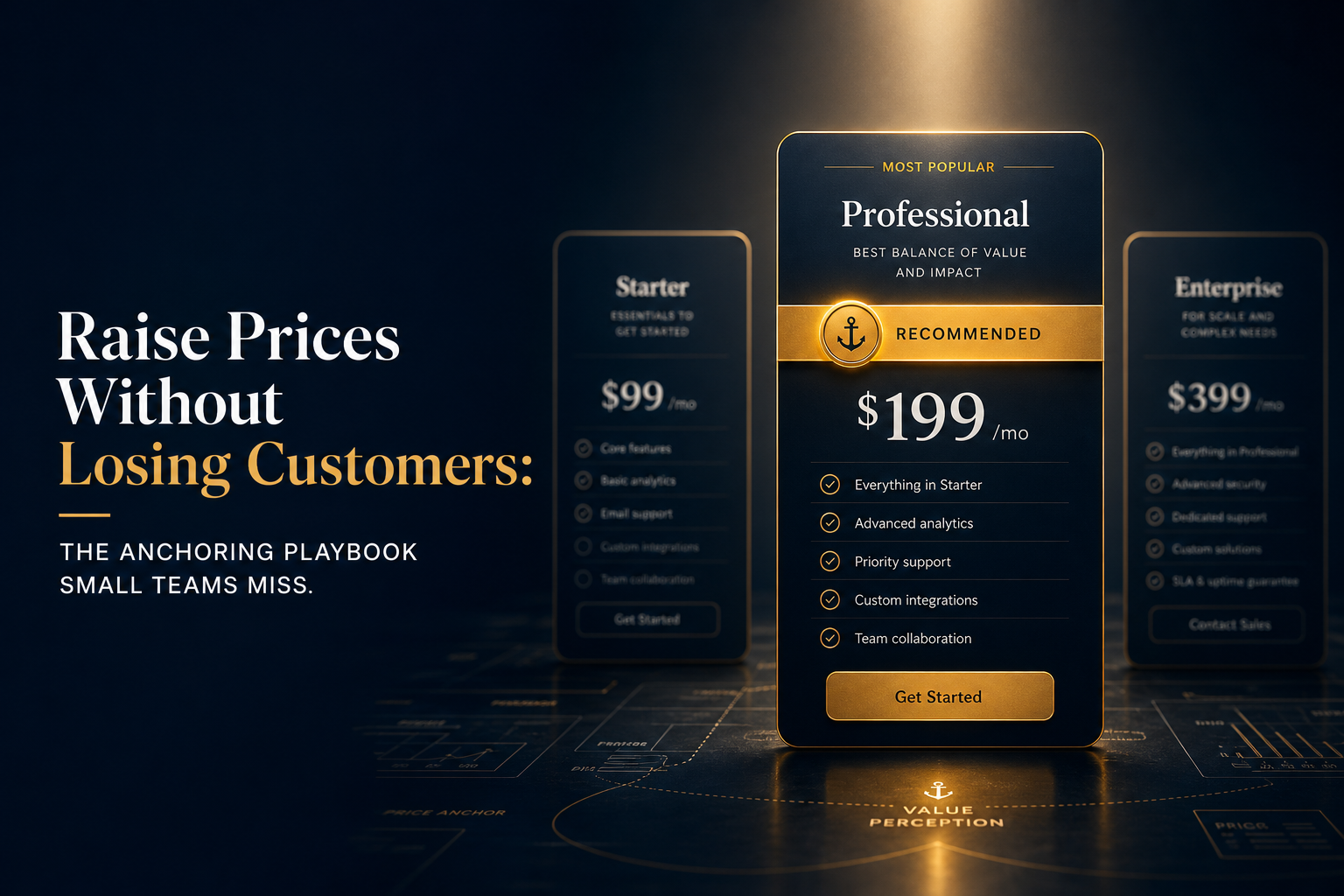
Price anchoring is one of the most well-documented findings in behavioral economics, and small business operators get it wrong in the same direction every time: they set their prices first, then build a page around them, never realizing the price a customer sees first shapes every price they see next. Daniel Kahneman’s research on cognitive anchors, detailed in Thinking, Fast and Slow, showed that an arbitrary first number can drag subsequent judgments toward it with startling reliability. Your pricing page is already running an anchoring experiment. The only question is whether you designed it or stumbled into it.
This article lays out how anchoring works in real pricing decisions, how to set anchors deliberately in your SaaS or service pricing, and where the tactic fails so badly it backfires. If you charge for anything, this is worth understanding before you touch your pricing page again.
What price anchoring actually does to a buyer’s brain
When a customer lands on a pricing page, they have no idea what anything should cost. They’re not comparing your tool to its objective value. They’re comparing your plans to each other, and they’re using the first number they encountered as the invisible ruler for every number that follows.
This is the anchor effect in action. Kahneman and Amos Tversky documented it extensively: people adjust from a starting point but rarely adjust far enough. If the first plan they see costs $199 per month, a $99 plan feels cheap by comparison. If the first plan they see costs $29, the same $99 plan suddenly feels expensive.
The practical consequence: the order and prominence of your pricing tiers matters as much as the numbers themselves. Anchoring isn’t a trick you add on top of pricing strategy. It’s a mechanism that’s already running, whether you planned it or not.
A telling experiment from a 1992 paper by Dan Ariely’s collaborators (later expanded in Ariely’s Predictably Irrational) showed that exposing people to a high number before asking them to evaluate a price consistently pushed valuations upward, even when the anchor was clearly arbitrary. Participants shown a high two-digit number from a spun wheel would later bid significantly more for unrelated items at auction than participants shown a low number. The anchor didn’t need to be logical. It just needed to come first.
The three anchoring mistakes that quietly leak revenue
Most small-team pricing pages share three structural problems that work against their own interests.
Listing the cheapest plan first
The instinct to lead with an accessible entry point is understandable, and wrong. When the $9/month plan anchors the page, your $49 plan looks expensive before a customer has read a single feature. Lead with your most ambitious tier or your most popular mid-tier, and the $9 plan becomes the deal it actually is.
Left-to-right reading habits matter here. In Western layouts, customers start reading from the left. Whatever is leftmost becomes the de facto anchor. If you want a customer to perceive your middle tier as reasonably priced, your top tier belongs at the left or at the top of a vertical layout. The middle plan then reads against the high anchor, not against the floor.
Anchoring with a monthly price, then billing annually
Showing a $49/month price while billing $588/year creates an anchoring mismatch. The customer anchored to $49 and is now confronted with a $588 line item at checkout. That gap triggers the “wait, is this actually expensive?” recalculation. Annual billing math should either be hidden or shown as a savings calculation off the monthly anchor, not surfaced as a lump sum until the customer has already committed.
Basecamp has historically used simple flat pricing, with a single annual number, to sidestep this problem entirely. That works when the flat rate is clearly lower than alternatives. For most SaaS teams, showing the monthly equivalent prominently while the annual billing happens in the background is the cleaner path.
Using round numbers that invite direct comparison
Round numbers feel arbitrary. $50, $100, $200 sit next to each other on a mental number line, and customers mentally halve and double them. Slightly irregular pricing ($49, $97, $189) doesn’t trigger the same arithmetic comparison. More practically, $97 anchored against $189 feels like a 50-dollar-something discount rather than a hundred-dollar one. The gap between the anchored tier and the target tier reads as smaller when neither number is a clean multiple of the other.
How to build an anchor that actually pulls buyers toward your target plan
Anchoring strategy has one job: make the plan you most want customers to choose feel like the obvious, reasonable middle ground. Here’s the structure that accomplishes it.
Put your highest tier first, always
The anchor should be the plan with the highest number on it, even if almost nobody buys it. Its job is not to sell. Its job is to make the plan below it feel proportionate. A $399/month Enterprise tier makes a $149/month Pro plan feel measured and justified. Without that anchor, $149 is just “expensive.”
If you sell services rather than SaaS, this applies to your rate card too. List your highest retainer engagement first, before the project rate, before the hourly. The hourly rate reads differently when it follows a $6,000/month retainer than when it floats on its own.
Name the anchor tier something that signals it’s for serious buyers
Plan names carry their own anchoring signal. “Enterprise,” “Agency,” or “Scale” implies a professional context that makes the price feel contextually appropriate. A plan called “Premium” at $399 lands differently than one called “Pro+” at the same price. The label sets expectations about who the price is for before the customer reads the feature list.
This also gives you a naming anchor you can use elsewhere. Your mid-tier becomes “Pro” (not “Basic Plus”), and the name signals it’s the substantive plan, not the consolation prize.
Highlight the target plan visually, not verbally
The “Most Popular” badge is everywhere, and customers have largely habituated to ignoring it. A stronger technique is visual prominence: make the target plan’s card slightly taller, give it a border in your brand’s main color, or increase the font size of its price. The anchor (your highest tier) sets the number context; the visual prominence of the target plan is the nudge that converts the decision.
The two mechanisms work together. The anchor does the price-rationalization work; the visual prominence does the choice-simplification work. They’re different cognitive levers, and running both is more effective than running either alone.
Anchoring in service pricing: where it gets complicated
For freelancers and agencies, anchoring works the same way, but the context is a conversation rather than a web page. The first number you mention becomes the anchor. If a client asks “what do you charge?” and you open with your day rate, every project quote that follows will be evaluated against that rate times however many days they imagine the project taking.
A better structure: open with a recent project budget (“we typically scope engagements in the $8,000 to $15,000 range for this type of work”) before mentioning any specific deliverable cost. That range anchor makes a $9,500 proposal feel like it lands in the expected zone. The same $9,500 quoted cold, against no anchor, feels like a number the client has to independently evaluate.
One practical application: before sending a proposal, include a brief “scope summary” section at the top that mentions the full engagement value before breaking out line items. The total is the anchor. The line items are then evaluated against a whole they’ve already accepted as reasonable, not added up from scratch toward a total they haven’t agreed to yet.
Where anchoring fails and costs you the sale
Anchoring isn’t a universal lever. A few conditions make it backfire.
If your anchor tier is so far above market rate that it reads as absurd, it doesn’t pull buyers toward the middle. It sends them to a competitor’s page. Anchors work because they’re the first available comparison point. If the customer knows enough to recognize the anchor as padded, it damages trust rather than framing value. The anchor must be defensible on features or scope, even if nobody buys it.
For sophisticated buyers, anchoring also carries a transparency risk. A procurement manager at a 200-person company has seen pricing pages before and knows the top tier is often a decoy. Layering too many behavioral tactics onto a page meant for buyers who will evaluate it analytically can read as manipulative rather than helpful. In those contexts, straightforward pricing with good documentation outperforms clever architecture. The deliberate use of decoy pricing works best on consumer-velocity SaaS products and self-serve flows, not on enterprise deals with a procurement review.
Anchoring also loses its effect if the buying cycle is long. A customer who visits your pricing page in January and returns in March has reset. The anchor from the first visit fades. In those cases, anchoring in the conversation matters more than anchoring on the page.
The compounding effect: anchoring plus the right copy sequence
Anchoring sets the price context. Copy determines what the customer believes the price buys. They’re not separate decisions.
The sequence that tends to convert best on a pricing page: lead with the anchor tier (highest price, prominent placement), then immediately introduce the target tier with a one-line outcome statement (“everything in Starter, plus the reporting that tells you where revenue actually comes from”), then the entry tier as a named starting point. The outcome statement matters because it ties the target-tier price to a specific job the customer needs done, not a feature list they have to interpret.
This mirrors what the best-converting landing page headlines do at a page level: they describe an outcome, not a capability. Applied to pricing, the outcome statement on the target tier is the micro-headline that closes the anchor-context gap. The customer has registered the high anchor, softened toward the target tier’s price, and the outcome statement gives them language to justify the decision internally.
Together, these three pieces (high anchor, visual prominence on the target tier, outcome-first copy) form a pricing page structure that works with the way buyers already think, rather than asking them to evaluate prices on abstract merit.
A calibration test you can run this week
Here is a concrete self-check for your current pricing page: cover the feature list on your target tier and show only the plan name and price to three people who aren’t familiar with your product. Ask them whether it feels expensive. If most say yes, your anchor is either absent or too weak. You’re asking buyers to evaluate price without a reference point.
Now uncover the top tier’s name and price and ask the same question again. If the answer shifts toward “seems about right” or “reasonable for what it includes,” your anchor is doing its job. If it doesn’t shift, either the anchor tier isn’t prominent enough in the actual page layout, or the gap between the two plans is too small to create the contrast effect.
Run the same test with your three most recent proposals if you sell services. Did you mention a total engagement range before the itemized quote? If not, you sent the quote without an anchor, and the client built their own comparison point, which is usually the cheapest alternative they found before talking to you.
What this changes about how you think about pricing
Pricing strategy is usually taught as a math problem: cost plus margin, or value-based calculation, or competitive benchmarking. Those inputs matter. But buyers don’t experience pricing as math. They experience it as context, and the context is almost entirely determined by what they saw first.
Kahneman’s framing is worth keeping: people don’t evaluate prices, they evaluate price differences. Your job as the person building the pricing page or sending the proposal is to make sure the difference the customer is measuring is the one that works in your favor. That’s not manipulation. It’s recognizing how decisions actually happen and designing your pricing communication to match.
The businesses that figure this out stop asking “is our price competitive?” and start asking “what does our price look competitive against?” Those are different questions, and the second one is the one that pays.
Frequently asked questions about price anchoring
Does anchoring work even if buyers know about it? Yes, with limits. Kahneman’s research found that awareness of anchoring reduces but does not eliminate its effect. Knowing the anchor is there doesn’t fully neutralize it, especially for buyers making decisions quickly. Where it matters most is with sophisticated procurement buyers who will explicitly discount the anchor in their evaluation.
How many pricing tiers should I have? Three is the conventional answer, and the research on the “compromise effect” (documented by Simonson and Tversky in a 1992 paper in the Journal of Consumer Research) supports it: buyers systematically choose the middle option more often when three options are present. A two-tier page removes the middle, and customers either take the low tier or abandon. A four-tier page dilutes the anchor effect by making the comparison harder to parse.
Can anchoring backfire in a downward direction? Yes. If you discount heavily or run promotions with a high “original price” crossed out next to a low “sale price,” you anchor on the sale price. Customers who see that anchor will resist paying full price later. SaaS products that train users with heavy discounts at acquisition routinely struggle with expansion revenue because the anchor is the discounted price, not the list price.
What’s the simplest anchoring fix I can make right now? Move your highest-priced tier to the leftmost position on your pricing page (or the top position in a vertical layout). That single change resets the anchor and starts the customer’s comparison from the right number. Pair it with a clear visual highlight on whichever tier you most want them to choose.