
Decoy pricing is one of the most reliably tested findings in behavioral economics, and it is quietly running on most SaaS pricing pages right now, whether the founder designed it intentionally or not. The short version: a third option that nobody buys can make a different option look far more attractive. Dan Ariely demonstrated this in a now-famous experiment using Economist subscription offers. When he offered a web-only plan at $59 and a print-plus-web bundle at $125, most readers chose the cheaper option. When he inserted a print-only plan at $125 (identical in price to the bundle, but clearly worse value), the bundle suddenly became the overwhelming choice. Nobody wanted the print-only plan. Its entire job was to make the bundle feel like a steal.
This is called the asymmetric dominance effect, and it does not require a designer or a behavioral economist on your team to work. It just requires understanding why it works, and then checking whether your current pricing page is applying it correctly, accidentally undermining it, or leaving it on the table entirely.
Why decoy pricing works at the neurological level
Humans are not good at evaluating value in absolute terms. Ask someone whether $125 is a reasonable price for a software subscription and they will shrug. Ask them whether $125 is reasonable when an inferior version costs the same amount, and the answer becomes obvious. The brain is a comparison engine, not a calculator. It does not ask “is this worth it?” It asks “is this worth more than the other thing?”
Ariely’s work, laid out in his book Predictably Irrational, describes this as relativity: we almost never make choices in absolute terms. We evaluate options against each other, and the composition of the choice set determines the outcome as much as the options themselves do. Change the set, and you change the decision, without changing the thing you actually want someone to buy.
For SaaS founders, this is actionable. Your pricing table is not just a list of plans. It is a choice architecture, and every plan in it affects how the others are perceived. Your job is to construct that architecture deliberately, not accidentally.
The three pricing page structures and what each one signals
Most SaaS pricing pages fall into one of three structures. Each creates a different psychological environment for the visitor.
Two plans
A two-plan setup forces a binary choice: basic or premium. The problem with binary choices is that they create the “should I?” question instead of the “which one?” question. Visitors start evaluating whether to buy at all rather than which tier fits them. Conversion psychology has a name for this: the two-option frame collapses into a yes/no decision, and yes/no decisions default to no at a much higher rate than which-of-three decisions do. If you have two plans, you are unintentionally optimizing for churn-before-trial.
Three plans
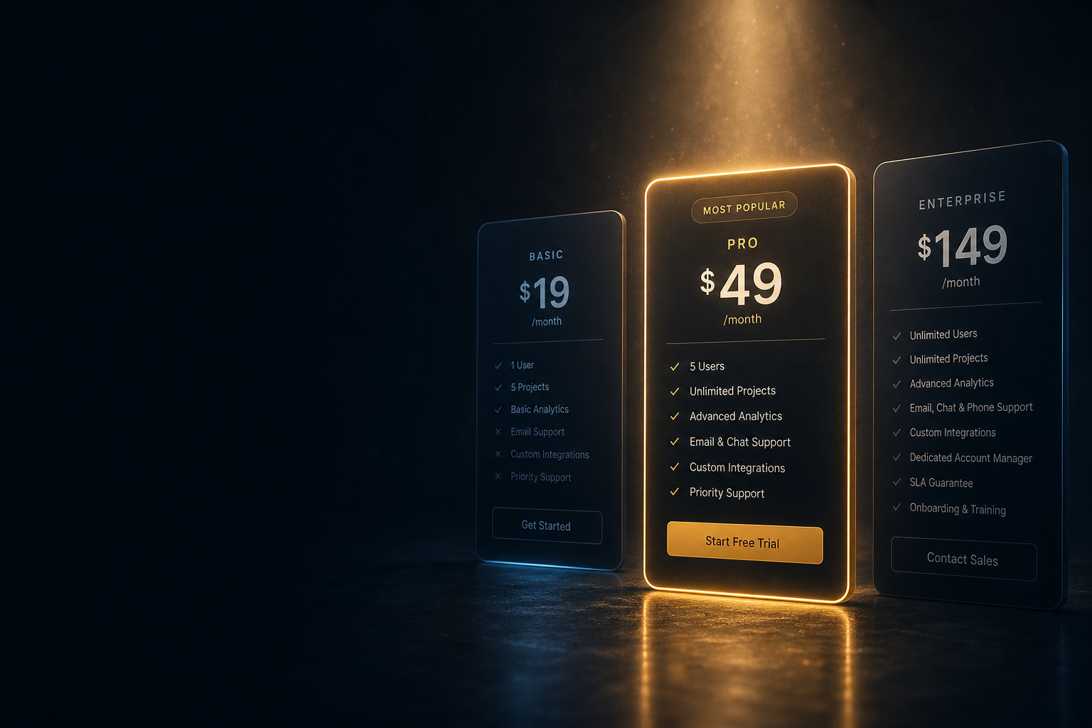
Three plans is the sweet spot, and most software pricing guides will tell you this. What they rarely explain is why. The real reason has nothing to do with covering customer segments. It is because the middle option in a three-plan layout gets a systematic cognitive boost from being flanked by extremes. Research by Itamar Simonson at Stanford showed that consumers systematically prefer the middle option when they are uncertain, a pattern he called the compromise effect. When people do not know how to evaluate quality differences, they default to “not the cheapest, not the most expensive” as a proxy for quality. The middle plan benefits from this even when its feature set is not demonstrably better than the others. This means your middle plan should almost always be your revenue target, and your highest plan exists partly to make the middle plan feel safe rather than premium.
Four or more plans
Four plans and above introduce what Barry Schwartz termed the paradox of choice: as options multiply, decision fatigue sets in and conversion rates drop. Each additional option adds cognitive load without adding proportional revenue. If your pricing page has four plans, you are likely confusing customers who should have been on your middle tier. The only time a fourth plan justifies itself is when you have a genuinely distinct enterprise segment with a separate buying process (and even then, separating it from the self-serve page entirely usually converts better than mixing the two).
How to place the decoy correctly
A decoy is not the same thing as a bad plan. A badly designed plan just makes you look disorganized. A well-designed decoy is inferior to the target option on a dimension that matters to the buyer, while being similar enough in price that the comparison is obvious. The key word is asymmetric dominance: the decoy must be dominated by your target option, but not dominated by all the options on the page.
Here is the practical test: your decoy should make the target option feel like an upgrade you are getting for free, or nearly free. If your target plan is $79/month and includes everything in your starter plan plus three features that matter, your decoy should be priced close to $79 and offer fewer of those three features. The visitor does the math instantly, finds the gap embarrassingly obvious, and picks the target plan because the decision has already been made for them by the structure of the table.
What fails: making the decoy cheap. If your decoy is $9/month and your target is $79/month, you have not created a comparison, you have created a gulf. The customer considers the cheap plan seriously, balks at the jump, and either picks the cheap plan or exits. The decoy only functions as a decoy when it is anchored within the same price range as the target.
What also fails: feature-stuffing the decoy out of generosity. Some founders feel uncomfortable offering a “lesser” plan and quietly add features to it until it is nearly as good as the target. This destroys the effect. The cognitive shortcut only fires when the comparison is easy and lopsided. Blur the lopsidedness and you are back to a standard binary choice.
The naming problem most pricing pages get wrong
Even a correctly structured decoy can be neutralized by plan naming. Names carry social signaling that overrides the feature comparison for a meaningful segment of buyers. “Starter,” “Basic,” and “Free” all share the same problem: they communicate that the buyer is a small, low-commitment customer. For a founder or operator with a real business, choosing “Starter” can feel like a public declaration that their operation is not serious yet.
The practical move is to name plans around outcomes or identities rather than size. “Solo,” “Team,” and “Studio” do the same structural job as “Basic,” “Pro,” and “Enterprise” but without the implicit hierarchy that makes buyers defensive. Alternatively, name by use case: “For individuals,” “For growing teams,” “For agencies.” The pricing page for tools like Linear’s pricing structure demonstrates this cleanly: plan names orient around who uses the product rather than how big (or small) the customer is.
Name changes alone have produced measurable conversion lifts in A/B tests across multiple SaaS companies. The reason is straightforward: a buyer who identifies with the plan name has already mentally committed before they finish reading the feature list. A buyer who rejects the name never fully evaluates the features.
Annual vs. monthly: where most SaaS pricing tables leave money
The default behavior on most pricing pages is to show monthly pricing with an annual toggle that reduces the number. This structure contains a hidden cost: monthly pricing is the anchor, and annual pricing is framed as a discount. Discounts are mentally categorized as something you might or might not take. The frame that converts better is the one that makes annual pricing the default anchor and monthly pricing the premium you pay for flexibility.
This sounds small. It is not. The cognitive difference between “save 20% with annual” and “pay 20% more for month-to-month” is the same 20%, but the second frame positions the annual plan as the normal choice and the monthly plan as the exceptional one. Defaulting the toggle to annual, or showing annual prices with a small monthly-equivalent note, shifts the reference point. Buyers who are genuinely price-sensitive will look for the monthly option and find it. Buyers who are evaluating commitment do not even register that they chose annual, because annual was the default they were shown.
Pairing this with your landing page’s value proposition matters here. If your landing page headline is doing its job, visitors arrive at the pricing page already committed to the outcome, not evaluating whether to commit. That pre-commitment is worth protecting with a pricing structure that reduces friction rather than reintroducing the yes/no question.
Where decoy pricing breaks down
Decoy pricing fails in predictable circumstances, and knowing them saves you from a pricing structure that looks correct but converts poorly.
It does not work when your buyer is a procurement department. Enterprise purchasing involves formal RFPs, vendor scorecards, and multi-stakeholder sign-off. The asymmetric dominance effect is a fast-cognitive shortcut. Slow, deliberate, committee-based purchasing routes around it entirely. If you sell to enterprise, your decoy architecture matters almost zero. What matters is your security documentation, SLA language, and the ease of your contract process.
It also breaks down when your plans are not genuinely comparable. If your tiers differ so dramatically in capability that they serve completely different use cases (solo freelancer vs. 500-seat team), visitors self-sort by fit rather than by the comparison the decoy is designed to trigger. The decoy effect is strongest when the differences between plans are incremental and felt, not categorical and obvious.
And it stops working when your pricing page is the wrong bottleneck. If visitors are dropping off because they do not understand what your product does, or because a competitor ranks better on their shortlist, a beautifully structured three-plan table with a perfect decoy will not save you. Pricing architecture is a conversion multiplier. It amplifies a good funnel; it cannot rescue a broken one. If fewer than 3 in 10 visitors who reach your pricing page are clicking any CTA at all, the pricing page structure is probably not your problem.
The pre-commit test for your own pricing page
Here is the Original Contribution this article earns: the pre-commit scan. Before analyzing pricing tiers or feature lists, look at your pricing page and ask one question: which plan would a first-time visitor with zero context land on? Not which plan you want them to pick. Which plan the page steers them toward through size, color, badge (“Most Popular”), and position.
If that plan is your highest-priced tier, you have a premium-anchor problem. Visitors who feel pushed toward the expensive option tend to retreat downward. The job of your visual hierarchy is to make the target feel like the obvious center, not the promotional option. If no plan is visually prominent, you have a structure problem. If the plan the page steers toward is actually your cheapest one, you have an anchoring problem in the wrong direction.
Run through this scan before any A/B test or pricing overhaul. It takes four minutes, it costs nothing, and it usually surfaces the real problem faster than three weeks of copy iteration.
Pricing architecture is not a design task you hand to a contractor. It is a strategic decision about which cognitive shortcut you want your customers to take. Ariely’s decoy effect gives you the mechanic. The pre-commit scan tells you whether your page is actually using it. Most pages are not, and that gap is where conversion rate improvements live.