
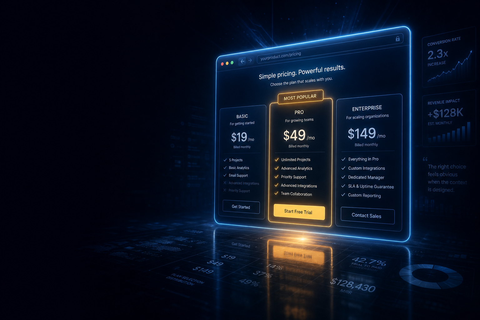
Pricing page design is probably the highest-leverage hour of work a SaaS founder or marketer will ever do — and most teams spend less time on it than they spend writing a single blog post. Researcher Dan Ariely documented in Predictably Irrational that the way options are framed and ordered has a larger effect on purchase decisions than the prices themselves. Your visitors are not running spreadsheets. They’re pattern-matching in milliseconds, and your pricing page’s structure is the pattern they match against.
The good news: you don’t need a new pricing model or a lower price point. Three specific structural decisions account for most of the difference between a pricing page that converts and one that just informs. This piece covers each one — what it is, why it works at the level of human decision-making, and how to implement it without hiring a conversion rate optimization agency.
Why Pricing Page Design Outweighs Price Points
Before getting into the three decisions, it’s worth understanding why structure beats price. Ariely’s now-famous decoy experiment, conducted at MIT and published in Predictably Irrational, offered magazine subscriptions in three formats: a web-only option at $59, a print-only option at $125, and a combined print-plus-web option at $125. Nobody chose the print-only option — it existed purely to make the combined option feel like an obvious deal. When Ariely removed the print-only decoy, the proportion of people choosing the $125 combined option collapsed. The decoy changed behavior without changing any actual price.
This is the core insight: people don’t evaluate prices in isolation; they evaluate them relative to the other options on the page. Your pricing page is not a menu. It’s a comparison engine, and you control what gets compared.
Kahneman and Tversky’s prospect theory, developed in 1979, adds another layer: losses feel roughly twice as powerful as equivalent gains. A visitor who perceives missing a feature as a “loss” will upgrade more readily than one who perceives gaining that feature as a “win.” Both of these mechanisms — decoy anchoring and loss aversion — can be built directly into a pricing page’s structure. Most pricing pages ignore both entirely.
Decision 1: Anchor High, Present Middle
Anchoring is the cognitive shortcut where the first number a person sees sets the reference point for every number they encounter afterward. On a pricing page, this means your most expensive plan should be the first thing visitors visually register — even if it’s displayed on the right side of a left-to-right grid.
The practical execution: if you run a three-tier pricing page, list your tiers left to right as Basic, Pro, Enterprise — but make the Enterprise column visually heavy. Big text, bold label, full feature list. Then highlight Pro (your actual conversion target) with a “Most Popular” badge and a contrasting background color. The Enterprise price, which visitors register first due to its visual weight, makes Pro feel like a bargain. This is not sleight of hand — it’s just giving visitors an accurate comparison point before they evaluate what they actually need.
A concrete example: if your Pro plan is $79/month and your Enterprise plan is $299/month, displaying Enterprise first makes $79 feel cheap. If you displayed Basic at $19/month first, $79 suddenly feels steep. Same three plans. Same three prices. Completely different conversion rates.
One thing to avoid: don’t anchor with a number so high it triggers disqualification. If 90% of your audience will never buy Enterprise, a $2,000/month anchor does more damage than good because visitors decide the product “isn’t for them” before they reach your actual target tier. The anchor should be high enough to reframe, not so high it filters out the audience.
Decision 2: Name Plans for Outcomes, Not for Tiers
Tier names are one of the most underused levers on a pricing page, and almost everyone wastes them. The default pattern — Basic, Pro, Enterprise, or Starter, Growth, Scale — tells visitors where they sit in a hierarchy. That’s it. The names do no psychological work.
Outcome-based naming does something different: it answers the question “who is this for?” before the visitor even reads the feature list. Compare these two sets of names for an email marketing tool:
- Starter / Pro / Enterprise
- Solo Sender / Growing Team / High-Volume Brand
The second set creates immediate self-selection. A freelancer reads “Solo Sender” and sees themselves. A startup marketing manager reads “Growing Team” and self-identifies. Neither needs to read every feature bullet to know which plan is theirs. This reduces decision friction and, crucially, makes upgrading feel like a natural progression rather than a financial penalty. You’re not “paying more.” You’re “becoming a Growing Team.”
The same principle applies to the naming of the CTA button within each tier. “Get Started” is noise — it appears on every SaaS pricing page on the internet and carries zero meaning. Replace it with outcome language tied to the plan name: “Start Sending Free,” “Scale My Campaigns,” “Talk to Sales.” Each button now tells a story about what happens next, not just that a thing will happen.
A Word on “Free Forever” vs. “Free Trial”
If your pricing page includes a freemium tier or a free trial, the framing of that offer deserves its own sentence. “Free forever” attracts users who may never convert; it signals “this tier is complete.” “Free trial” frames the paid plan as the destination. Which framing serves your model depends on whether you’re running a product-led growth model (where the free tier is your acquisition engine) or a sales-led motion (where the trial is a qualifier). Neither framing is universally right, but using the wrong one for your model leaves conversions on the table every month.
Decision 3: Frame Upgrades as Loss Prevention
Kahneman and Tversky’s finding that losses feel twice as painful as gains is one of the most replicated results in behavioral economics. A pricing page that describes what users gain by upgrading works against this bias. A pricing page that describes what users miss by staying on a lower tier works with it.
The difference in copy is subtle but the effect is real. Consider these two framings for a project management tool’s Pro tier:
- Gain framing: “Pro includes advanced reporting, priority support, and API access.”
- Loss framing: “Without Pro: no advanced reporting, no priority support, no API. Your team is working blind.”
The second version is harsher, and some brands won’t want to run it verbatim. But the underlying structure — naming specifically what the lower tier lacks, rather than only what the upper tier adds — is fair and accurate. You’re not hiding anything. You’re just sequencing the information in the order the brain finds most motivating.
A softer execution: use a feature comparison table where lower tiers show explicit “Not included” or a grey-out icon rather than a blank space. Blank space implies absence. An explicit marker makes the absence felt. This is why the best SaaS pricing tables use a strikethrough or a closed-lock icon for unavailable features rather than simply omitting the row. The gap registers as a loss, not just a missing checkbox.
This connects to another structural choice: where to put your feature comparison table. Most pricing pages put the full comparison table far below the fold, after a decorative hero section and three paragraphs of positioning copy. Visitors who would have upgraded based on a specific feature — the feature that sits in row 23 of the table — never scroll that far. Move the comparison table closer to the top, or put the three most decision-relevant features directly in the tier cards themselves, not buried below.
Putting It Together: The Minimal Viable Pricing Page
You don’t need to implement all of this in a single redesign sprint. The highest-return sequence is: anchor first, then names, then loss framing. Here’s why that order matters.
Anchoring affects every visitor from the moment the page loads. Getting that right costs you nothing except column ordering and visual weight. Plan naming affects every visitor who reads past the price. CTA framing and loss-aversion copy require more rewriting and potentially A/B testing to validate. Start with the structural changes that take thirty minutes, measure, then layer in the copy changes.
If you use a tool like Webflow, Framer, or a dedicated landing page builder, all three of these changes are in-browser edits with no developer time. If you’re running Stripe’s hosted billing portal or a similar out-of-the-box solution, your customization options are narrower — but the plan naming and CTA text are almost always configurable even in hosted environments. The anchoring logic still applies to how you order your tiers.
For teams using automation tools to route trial sign-ups into onboarding sequences, the pricing page and the first nurture email need to speak the same language. If your pricing page uses outcome-based plan names (“Growing Team”) but your first onboarding email says “Welcome to Pro,” you’ve created a micro-dissonance that undermines the identity the pricing page just built. Keep the naming consistent from page to inbox — and if your onboarding sequences are handled through a platform like Zapier or Make, the routing logic that sends users to different sequences based on their plan tier is worth setting up early, because pricing page copy changes are only half the conversion system.
What Most Pricing Pages Get Wrong
The most common failure mode isn’t a bad price or a bad feature set. It’s a pricing page that treats the visitor as a rational evaluator rather than a pattern-matching human being. Walls of feature bullets, identical CTA buttons on every tier, no visual hierarchy, no plan that feels like “the obvious choice” — these are the signs of a page designed by someone who was too close to the product to see it through a visitor’s eyes.
The second most common failure is treating the pricing page as a one-time project. Conversion rates on pricing pages drift. Feature sets evolve. Competitors change their pricing. The visitors arriving in eighteen months will have different reference points than the ones arriving now. A pricing page that converted well at launch can quietly decay into a conversion liability while the rest of the business grows around it.
Put a calendar reminder to audit your pricing page structure every six months: check whether the anchor is still credible, whether the plan names still describe your actual users, and whether the comparison table reflects the features your sales conversations actually hinge on. That audit takes two hours. The conversion rate gains from catching one misalignment pay for it many times over.
Pricing Page Design: The Checklist Before You Publish
Before any pricing page goes live, run through these six checks:
- Anchoring: Does your highest-priced plan register first visually, even if it’s physically on the right?
- Middle-tier highlight: Is your target conversion tier marked as “Most Popular” or equivalent, with a contrasting background?
- Plan names: Do the names describe outcomes or user identities, not just tiers?
- CTA buttons: Does each button say something different and outcome-specific, not “Get Started” three times?
- Loss framing: Does the comparison table make missing features visible (lock icon, strikethrough, explicit “Not included”) rather than simply absent?
- Fold placement: Are your three most decision-relevant feature differentiators visible above the fold, in the tier cards themselves?
Pricing is one of the few levers in SaaS where the structure of the decision matters as much as the substance of the offer. Ariely’s decoy experiment didn’t change any prices — it removed one option — and purchase behavior shifted dramatically. Your pricing page is running a version of that experiment on every visitor who lands on it. The only question is whether you designed the experiment intentionally or left it to chance.
Frequently Asked Questions
How many pricing tiers should a SaaS pricing page have?
Three tiers is the most effective structure for most SaaS products. Two tiers removes the anchoring and decoy effect that makes the middle option feel like a clear choice. Four or more tiers creates decision paralysis. If you have an Enterprise tier that requires a sales conversation, list it as a fourth option but with a “Contact Sales” CTA rather than a price, so it doesn’t clutter the comparison logic for self-serve buyers.
Should I show annual vs. monthly pricing by default?
Show annual pricing as the default, with a visible toggle to monthly. Annual pricing reinforces commitment and typically displays a lower monthly equivalent, which anchors expectations favorably. The toggle gives cautious buyers an exit without making them feel pressured. Most SaaS companies that switched from monthly-default to annual-default report a meaningful uptick in annual plan selections with no meaningful drop in total sign-ups.
Does a “Money-Back Guarantee” badge improve conversions?
Yes, but placement matters more than the badge itself. A guarantee badge placed near the primary CTA reduces perceived risk at the moment of decision. A guarantee buried in footer copy is functionally invisible. The language matters too: “30-day money-back guarantee” outperforms “try risk-free” because it names the specific commitment rather than vaguely implying one.
When should I use a freemium tier on the pricing page?
Only when your product delivers genuine standalone value at the free tier and your growth model depends on viral adoption or word-of-mouth. If the free tier is weak enough that most free users churn without converting, listing it on the pricing page can actually hurt conversion rates by giving fence-sitters an easy out. In that case, a time-limited free trial with no permanent free tier is usually the better structural choice.