
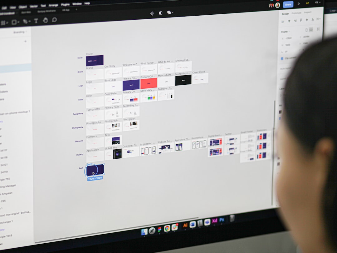
The button sits exactly where you expect it, but the text inside is clipping. You stretch the container wider, and the text stays stubbornly narrow, refusing to fill the space. You try to give it a width of 100 percent, but it ignores you. You check the CSS, and the CSS says nothing. It says nothing because there is no CSS. You are looking at a constraint system, not a document flow, and you are trying to solve a layout problem with a visual editor.
Figma’s Auto Layout is not a visual approximation of CSS Flexbox. It is a constraint system that operates on a completely different set of logic. When you treat it like a mini-browser, you will fight it. When you treat it like a rigid structural grid, you will build interfaces that actually scale.
The Core Misunderstanding: Document Flow vs. Constraints
CSS Flexbox is a document flow engine. It takes a stream of content, applies a set of rules, and lets the browser calculate the final dimensions based on the available viewport. The browser is the engine; you are the driver. You set the rules, but the browser calculates the math.
Figma’s Auto Layout is a constraint system. It does not calculate. It enforces. You set the rules, and the tool enforces them rigidly. There is no viewport. There is no browser. There is only the relationship between the container and its children, defined by the constraints you explicitly set.
This distinction is the single most common source of friction for designers moving from Figma to development. In CSS, a container with a width of 100 percent will stretch to fill its parent. In Figma, a container with a width of 100 percent will stretch to fill its parent, but only if you have explicitly set the width constraint to “Fill Container.” If you have not, the container will remain exactly the width of its content, regardless of how wide you make the parent frame. The browser does the math for you. Figma does not.
You are not building a webpage. You are building a structural model. The difference is subtle, but it changes how you approach every single layout decision.
Why 100 Percent Width Does Not Mean 100 Percent Width
When you set a width constraint to “Fill Container” in Figma, you are telling the tool to stretch the frame to the edges of its parent. That is a visual instruction. It is not a mathematical calculation of available space. It is a rigid boundary.
In CSS, a 100 percent width is a relative calculation. It looks at the parent, subtracts padding and borders, and gives you the remaining space. In Figma, 100 percent width is a visual boundary. It stretches to the edge, period. If you have padding on the parent, the child will touch the padding. If you have a border, the child will touch the border. The browser handles the subtraction.
This is why your buttons look perfect in Figma but break in development. You set the button to “Fill Container” and expect it to behave like a CSS block element. It does not. It behaves like a rigid box that you have explicitly told to stretch to the edge. If you change the padding on the parent, the button does not recalculate. It stays exactly where you told it to go.
The solution is to stop thinking in percentages and start thinking in constraints. Every element in your Auto Layout frame must have an explicit constraint. Width, height, horizontal, vertical. If you leave one blank, the element will not stretch. It will remain fixed. This is not a bug. It is the feature. It forces you to make a decision about every single element in your layout.
The Four Constraints You Must Master
Figma’s Auto Layout operates on four explicit constraints. Width, height, horizontal, and vertical. You must set all four for every single frame. Leaving one blank is not a neutral act. It is a decision to fix that dimension, and it will cause silent failures downstream.
Width: This controls the horizontal size of the frame. You can set it to a fixed pixel value, or you can set it to “Fill Container.” If you set it to “Fill Container,” the frame will stretch to the edges of its parent. If you set it to a fixed value, the frame will remain exactly that width, regardless of how wide you make the parent.
Height: This controls the vertical size of the frame.
Horizontal: This controls how the frame behaves horizontally when the parent changes size. You can set it to “Left,” “Right,” “Center,” or “Space Between.” If you set it to “Left,” the frame will always stay on the left edge of the parent. If you set it to “Right,” the frame will always stay on the right edge. If you set it to “Center,” the frame will always stay in the middle. If you set it to “Space Between,” the frame will push to the far edges, leaving empty space in the middle.
The options mirror the horizontal constraints: “Top,” “Bottom,” “Center,” and “Space Between.” Setting a vertical constraint ensures your element stays anchored to the correct edge, even when the parent frame resizes dynamically.
When you set all four constraints explicitly, you create a rigid structural model. The frame will behave exactly as you expect, regardless of how the parent changes size. This is the key to building scalable interfaces. You are not relying on the browser to calculate the layout. You are defining the layout explicitly.
When Auto Layout Fails: The Rigid vs. Flexible Trap
Auto Layout fails when you try to use it for flexible, fluid layouts. It is designed for rigid, structured layouts. If you need a layout that stretches and shrinks based on the content, Auto Layout is the wrong tool. Use a CSS Flexbox container instead.
When you use Auto Layout for a fluid layout, you will encounter the rigid vs. flexible trap. You will set a width constraint to “Fill Container,” and you will expect the content inside to stretch. It will not. The container will stretch, but the content will remain fixed. You will have to manually adjust the content constraints to make it stretch.
The solution is to use Auto Layout for rigid layouts and CSS Flexbox for fluid layouts. Do not try to force Auto Layout to behave like CSS Flexbox. It will not work. It is not designed for it. Use the right tool for the job.
How to Build Scalable Interfaces With Constraints
Building scalable interfaces with constraints requires a shift in mindset. You are not designing a webpage. You are designing a structural model. Every element must have an explicit constraint. Every relationship must be defined. There is no room for ambiguity.
Start by defining the rigid structure. Set the width and height constraints for every frame. Set the horizontal and vertical constraints for every frame. Make sure every element has an explicit constraint.
Next, define the relationships. How do the elements relate to each other? Do they stack vertically? Do they sit side by side? Do they stretch to fill the container? Define the relationships explicitly. Define the layout explicitly.
Finally, test the constraints. Resize the parent frame. Does the layout behave as expected? If not, adjust the constraints.
When to Use CSS Instead of Auto Layout
Auto Layout is not a replacement for CSS. It is a tool for building rigid, structured layouts. When you need a fluid, flexible layout, use CSS. When you need a layout that stretches and shrinks based on the content, use CSS. When you need a layout that responds to the viewport, use CSS.
Auto Layout is for building the skeleton. CSS is for building the skin. Do not try to use Auto Layout for the skin.
FAQ
Is Figma Auto Layout the same as CSS Flexbox?
No. Auto Layout is a constraint system. They operate on completely different logic. Auto Layout enforces rules. CSS Flexbox calculates them.
Why does my button not stretch when I set width to 100 percent?
Because 100 percent in Figma is a visual instruction, not a mathematical calculation. You must explicitly set the width constraint to “Fill Container.” If you do not, the button will remain fixed.
Should I use Auto Layout for all my layouts?
No. Use Auto Layout for rigid, structured layouts. Use CSS Flexbox for fluid, flexible layouts.
How do I make my layout responsive?
You do not make Auto Layout responsive. You make it rigid. You define the constraints explicitly. You define the layout explicitly. If you need responsiveness, use CSS.
Can I export Auto Layout to CSS automatically?
No. Figma does not export Auto Layout to CSS automatically. You must manually translate the constraints into CSS. This is a feature, not a bug. It forces you to understand the layout explicitly.
Sources & Further Reading
- Auto Layout — Figma
- Flexbox: Flexible Box Layout Module — W3C
Photo by Budka Damdinsuren on Unsplash.